
Customizing Font Size and Weight in Nastaleeq Web Pro – A Visual Guide
Introduction
Typography is not just about choosing the right font. It is also about size, weight, and how these elements work together to create a harmonious visual experience. The same Urdu text can feel authoritative or playful, formal or casual, depending entirely on how large you make it and how much emphasis you apply.
As we explored in our guide to copying web-ready code, Nastaleeq Web Pro gives you complete control over your typography. In this eleventh post of our launch series, I will focus specifically on two of the most powerful customization tools: font size and font weight.
By the end of this visual guide, you will understand exactly how to use the font size slider and font weight selector to create the perfect look for every piece of Urdu content you publish.
Why Font Size and Weight Matter
Before we dive into the mechanics, let us understand why these two controls are so important.
As detailed in our post about solving real problems, most Urdu typography tools offer limited or no control over size and weight. You get whatever the developer decided was “good enough.” This one-size-fits-all approach fails because different contexts demand different treatments.
Font Size Affects:
-
Readability – Text that is too small strains the eyes. Text that is too large feels overwhelming.
-
Hierarchy – Larger text signals importance (headlines, titles). Smaller text signals supporting information (captions, footnotes).
-
Mood – Very large text feels bold and confident. Very small text feels subtle and detailed.
-
Accessibility – Older readers or those with visual impairments need larger text.
Font Weight Affects:
-
Emphasis – Bold text draws attention. Normal text recedes into the background.
-
Tone – Bold feels strong and assertive. Light feels delicate and refined.
-
Hierarchy – Within a block of text, bold can highlight key terms or phrases.
-
Contrast – Mixing weights creates visual interest and guides the reader’s eye.
As we discussed in our beginner’s guide, mastering these controls is the difference between amateur and professional-looking Urdu content.
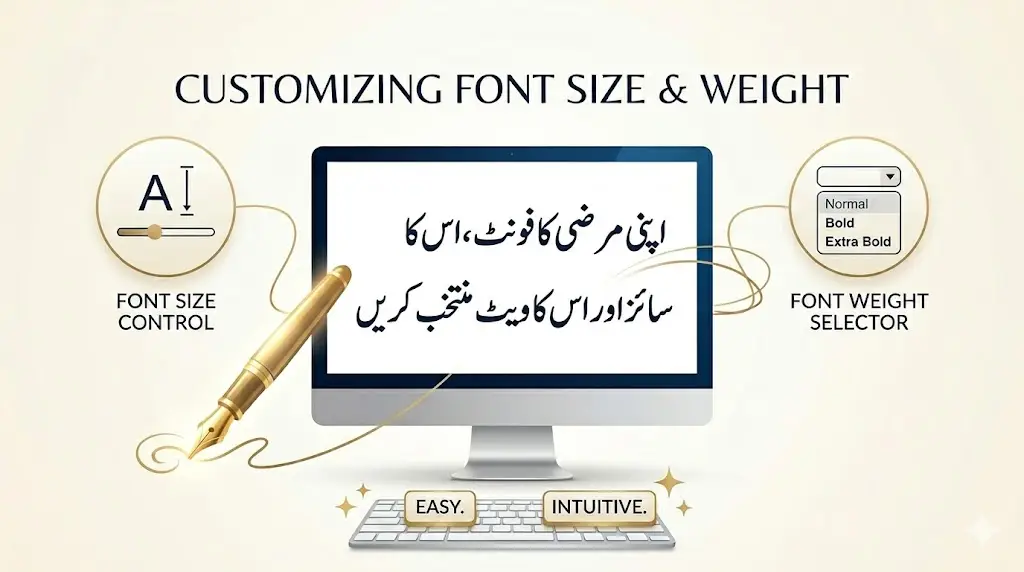
Meet the Controls: A Visual Tour
When you open Nastaleeq Web Pro, you will find two controls in the font customization section:
The Font Size Slider
Location: Middle of the controls group
Appearance: A horizontal slider with a numerical display
Range: 16 pixels (minimum) to 72 pixels (maximum)
Default: 28 pixels
The current font size is displayed above the slider in real time. As you drag the slider left or right, the number updates instantly – and more importantly, the live preview updates instantly.
The Font Weight Selector
Location: Right side of the controls group
Appearance: A dropdown menu
Options:
-
Normal (400) – Standard weight for body text
-
Bold (700) – Emphasized weight for headings and key phrases
-
Extra Bold (900) – Strong emphasis for maximum impact
Default: Bold (700)
Font Size Guidelines: Choosing the Right Size
Different types of content call for different font sizes. Here is a practical guide based on common use cases.
16-20px: Fine Print and Captions
Best for:
-
Image captions
-
Footnotes and endnotes
-
Legal disclaimers
-
Metadata (dates, author names)
-
Sidebar content
Example use: A photo caption under an image in a blog post.
Pro tip: At this size, prioritize legibility. Use clean Naskh fonts like Lateef or Harmattan rather than highly decorative Nastaleeq fonts.
24-32px: Standard Body Text
Best for:
-
Blog posts and articles
-
Educational materials
-
Email newsletters
-
Most web content
Example use: The main text of a 1000-word Urdu article.
Pro tip: This is the sweet spot for most content. Our default of 28px was chosen after extensive testing with native Urdu readers. As noted in our font exploration post, Jameel Noori Nastaleeq and Noto Nastaliq Urdu both perform beautifully at this range.
36-48px: Headings and Subheadings
Best for:
-
Article titles
-
Section headings
-
Pull quotes
-
Testimonials
Example use: The title of a blog post or a chapter heading in an online book.
Pro tip: At larger sizes, you can use more decorative fonts. Alvi Nastaleeq and Reem Kufi shine at 40px and above.
52-72px: Headlines and Posters
Best for:
-
Hero section headlines
-
Landing page titles
-
Posters and flyers
-
Social media graphics
-
Billboards (digital)
Example use: A bold welcome message on a website’s homepage.
Pro tip: At these extreme sizes, pay attention to line breaks. Very long lines at large sizes can be difficult to scan. Use our live preview to test different widths.
Font Weight Guidelines: Choosing the Right Weight
The font weight selector gives you three options. Here is when to use each.
Normal (400)
Best for:
-
Long-form reading (articles, books)
-
Body text
-
Supporting content
-
When you want the font’s natural character to shine
Example use: The main text of a novel or long article.
Pro tip: Normal weight is the most legible for extended reading. Use it for anything your audience will read for more than a few minutes.
Bold (700)
Best for:
-
Headings and subheadings
-
Key phrases within body text
-
Buttons and calls to action
-
Navigation menus
-
Emphasis without shouting
Example use: The title of a section or a highlighted term within a paragraph.
Pro tip: Bold creates contrast without overwhelming. It is our default weight for a reason – it works well in most contexts.
Extra Bold (900)
Best for:
-
Hero headlines
-
Strong calls to action
-
Posters and banners
-
Maximum emphasis situations
-
When you want text to dominate the page
Example use: A “SALE” banner or an urgent announcement.
Pro tip: Use extra bold sparingly. Too much extra bold text loses its impact and can feel aggressive to readers.
Combining Size and Weight: Practical Scenarios
The real power of Nastaleeq Web Pro comes from combining size and weight thoughtfully. Here are some proven combinations.
Scenario 1: A Blog Post
| Element | Font Size | Font Weight |
|---|---|---|
| Post Title | 42px | Extra Bold |
| Section Heading | 32px | Bold |
| Body Text | 26px | Normal |
| Caption | 18px | Normal |
Why this works: The title grabs attention. Section headings create clear visual breaks. Body text is comfortable to read. Captions recede appropriately.
Scenario 2: A Poetry Collection
| Element | Font Size | Font Weight |
|---|---|---|
| Poem Title | 36px | Bold |
| Verse | 28px | Normal |
| Stanza Break | (blank line) | N/A |
Why this works: Poetry thrives on elegance. Normal weight allows the font’s calligraphic character to shine. Bold is reserved for titles only.
As we explored in our Nastaleeq vs Naskh comparison, authentic Nastaleeq fonts like Alvi carry emotional weight that mechanical Naskh cannot replicate. Do not overpower that beauty with unnecessarily heavy weights.
Scenario 3: Educational Material for Children
| Element | Font Size | Font Weight |
|---|---|---|
| Lesson Title | 48px | Extra Bold |
| Instruction | 32px | Bold |
| Example Text | 28px | Normal |
| Vocabulary Word | 30px | Bold |
Why this works: Children need larger text for readability. Extra bold and bold create clear visual hierarchy. Playful fonts like Baloo Bhaijaan 2 work wonderfully here.
Scenario 4: A Professional Report
| Element | Font Size | Font Weight |
|---|---|---|
| Report Title | 36px | Bold |
| Section Heading | 28px | Bold |
| Body Text | 24px | Normal |
| Footnote | 16px | Normal |
Why this works: Professional documents need restraint. Avoid extra bold except for the most critical elements. Clean Naskh fonts like Scheherazade New convey authority.
Live Preview: Your Best Friend
As we emphasized in our launch post, the live preview in Nastaleeq Web Pro updates instantly as you adjust size and weight. This real-time feedback is invaluable.
Always test before you commit. What looks good in theory may not look right in practice. A font size that works perfectly for one font may feel too large or too small for another. Different fonts have different x-heights, different stroke widths, and different optical sizes.
For example, Jameel Noori Nastaleeq at 28px has a different visual weight than Noto Nastaliq Urdu at 28px. The live preview lets you compare side by side instantly.
Accessibility Considerations
As a responsible content creator, you should consider readers with visual impairments or reading difficulties.
Minimum Font Sizes
-
Body text: Never go below 16px. 18-20px is safer for general audiences.
-
Critical information: Use at least 20px.
-
Elderly readers: Consider 24px or larger.
Weight and Contrast
-
Normal weight (400) is generally the most legible for long passages.
-
Bold can be harder to read at very small sizes.
-
Extra bold works best at large sizes (36px+).
Testing
Before publishing, test your content on different devices. What looks perfect on a 27-inch desktop monitor may be unreadable on a smartphone. Nastaleeq Web Pro’s live preview is responsive – resize your browser window to see how your text will look on different screen sizes.
Common Mistakes to Avoid
Even experienced designers make mistakes. Here are some pitfalls to watch for.
Mistake 1: Everything Bold
When every word is bold, nothing stands out. Reserve bold for emphasis and hierarchy.
Mistake 2: Inconsistent Sizes
Using too many different font sizes creates visual chaos. Stick to a consistent system (title, heading, body, caption).
Mistake 3: Ignoring Line Length
Very long lines of text are difficult to read, regardless of font size. Keep line lengths reasonable (50-75 characters per line is ideal).
Mistake 4: Forgetting Mobile
A font size that works on desktop may be tiny on mobile. Test on multiple devices before publishing.
Saving Your Favorite Combinations
Nastaleeq Web Pro does not require user accounts (privacy first!). But you can still save your favorite size and weight combinations.
Simple method: Keep a text file or notebook with your preferred settings. For example:
-
Poetry: Jameel Noori Nastaleeq, 32px, Normal
-
Headlines: Reem Kufi, 48px, Extra Bold
-
Children’s content: Baloo Bhaijaan 2, 36px, Bold
When you return to Nastaleeq Web Pro, you can quickly recreate your favorite combinations.
Call to Action
You now understand how to use font size and weight to create professional, beautiful Urdu typography. These controls are simple, but their impact is profound.
Visit Nastaleeq Web Pro today. Experiment with different sizes. Try all three weights. Watch the live preview transform your words. Find the perfect combination for your voice.
Your words deserve to be seen at the perfect size and weight. Nastaleeq Web Pro gives you that power.
Frequently Asked Questions
What is the best font size for body text?
For most content, 24-32px is ideal. Our default of 28px works well across a wide range of fonts and use cases.
When should I use extra bold?
Use extra bold sparingly – for hero headlines, strong calls to action, and situations where you need maximum impact. Avoid extra bold for long passages of text.
Does font weight affect font rendering?
Yes. Some fonts have better-designed bold weights than others. Always check the live preview to ensure the bold version looks good.
Can I use different sizes for different parts of the same text?
Yes. Generate web-ready code for each section separately, then combine them in your HTML editor. This allows you to create rich, varied typography.
What if I need a size larger than 72px?
For extreme sizes (posters, billboards), you can edit the generated CSS directly. Change the font-size value to any number you need.
Pingback: 1000-Word Limit in Nastaleeq Web Pro Free Version
Pingback: How Writers Benefit from Nastaleeq Web Pro