
Nastaleeq vs Naskh – Understanding the Difference and Why It Matters
Introduction
If you have ever worked with Urdu text online, you may have noticed that not all Urdu fonts look the same. Some appear flowing, elegant, and almost artistic, with words cascading diagonally across the page. Others look more structured, uniform, and mechanical, with letters sitting neatly on a straight line.
These two distinct styles are called Nastaleeq and Naskh. While both scripts are used for writing Urdu, they serve different purposes, evoke different emotions, and face vastly different challenges in the digital world. Understanding the difference between Nastaleeq and Naskh is essential for anyone who publishes Urdu content online.
As we explored in our introductory post, Nastaleeq Web Pro was built to solve the rendering challenges of authentic Urdu typography. In this sixth post of our launch series, I will explain the key differences between Nastaleeq and Naskh, why Nastaleeq is the preferred style for poetry and literature, why Naskh dominates digital platforms, and why this distinction matters for your Urdu content.
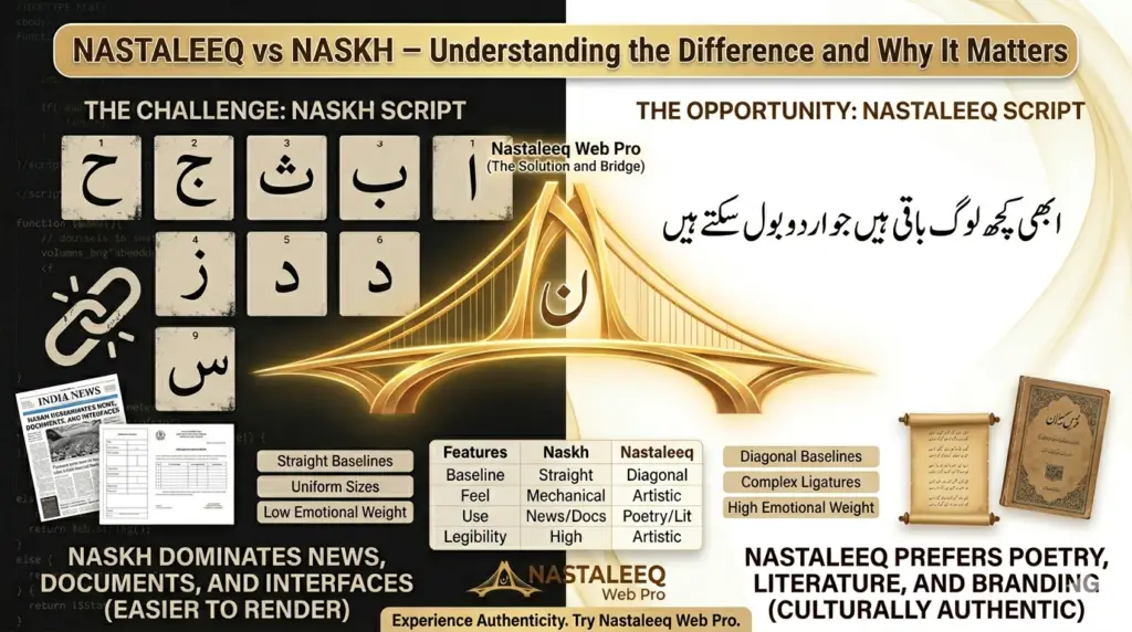
What is Naskh? The Structured Script
Naskh is one of the earliest and most fundamental scripts in Arabic calligraphy. Developed in the 10th century, Naskh was designed for clarity, legibility, and efficiency. Unlike the flowing curves of Nastaleeq, Naskh characters sit on a straight horizontal baseline. Letters are relatively uniform in size, spacing is consistent, and the overall appearance is clean and mechanical.
Characteristics of Naskh:
-
Straight baselines – All letters sit firmly on a horizontal line
-
Uniform letter sizes – Characters have consistent height and width
-
Simple connections – Letters connect in predictable, straightforward ways
-
No overlapping – Characters do not sit inside one another
-
High legibility – Even at small font sizes, Naskh remains readable
Where Naskh is Used:
Because of its clarity and simplicity, Naskh became the standard script for:
-
The Quran – Most printed versions of the Quran use Naskh
-
Newspapers and books – Arabic and Urdu newspapers often use Naskh for body text
-
Official documents – Government forms and legal documents frequently use Naskh
-
Digital interfaces – Most operating systems and browsers default to Naskh-style fonts
The technical simplicity of Naskh makes it far easier to render digitally. As explained in our story behind the tool, this is why most “Urdu fonts” online are actually Naskh fonts in disguise – they are simply easier to build and display.
What is Nastaleeq? The Artistic Script
Nastaleeq emerged in 14th-century Persia as a fusion of two earlier scripts: Naskh and Ta’liq. The result was a script of breathtaking beauty – flowing, elegant, and deeply expressive. Nastaleeq became the preferred script for Persian and Urdu poetry, literature, and formal writing.
Characteristics of Nastaleeq:
-
Diagonal baselines – Words flow downward from right to left, creating a cascading effect
-
Variable letter sizes – Letters stretch and compress based on context
-
Complex ligatures – Characters merge in intricate, unpredictable ways
-
Overlapping characters – Letters often sit partially inside one another
-
Expressive flourishes – Descenders and ascenders create visual rhythm and movement
Where Nastaleeq is Used:
Nastaleeq is reserved for contexts where beauty and artistry matter most:
-
Urdu poetry – The verses of Ghalib, Iqbal, and Faiz are traditionally written in Nastaleeq
-
Literary works – Novels, short stories, and literary magazines prefer Nastaleeq
-
Wedding invitations – Formal announcements use Nastaleeq for elegance
-
Branding and logos – Companies seeking a traditional or artistic image choose Nastaleeq
However, as we detailed in our post about font struggles, the very features that make Nastaleeq beautiful also make it exceptionally difficult to render on digital screens.
Key Differences Between Nastaleeq and Naskh
To help you understand the distinction clearly, here is a side-by-side comparison:
| Feature | Naskh | Nastaleeq |
|---|---|---|
| Baseline | Straight, horizontal | Diagonal, descending right-to-left |
| Letter size | Uniform and consistent | Variable, context-dependent |
| Connections | Simple, predictable | Complex, intricate ligatures |
| Overlapping | None | Letters often overlap |
| Digital support | Excellent, widely supported | Poor, inconsistent across devices |
| Primary use | Newspapers, documents, interfaces | Poetry, literature, formal writing |
| Emotional feel | Clean, professional, mechanical | Artistic, elegant, expressive |
| Rendering difficulty | Easy | Very difficult |
This table explains why most digital tools default to Naskh. But as our dedicated team discovered, Urdu writers deserve better than settling for the easier option.
Why the Distinction Matters for Urdu Content
Understanding the difference between Nastaleeq and Naskh is not just an academic exercise. It has real implications for how your audience perceives your content.
1. Emotional Impact
Nastaleeq carries emotional weight that Naskh cannot replicate. A poem written in Naskh feels mechanical and cold. The same poem written in authentic Nastaleeq feels warm, artistic, and deeply connected to centuries of literary tradition. The script itself becomes part of the message.
2. Cultural Authenticity
For native Urdu readers, Nastaleeq is not just a font – it is the script of their literary heritage. When they see Urdu presented in Naskh, it can feel foreign, inauthentic, or even disrespectful. Using authentic Nastaleeq signals that you respect the language and its traditions.
3. Reader Expectations
Urdu poetry lovers expect to see verses in Nastaleeq. Literary journal readers anticipate the flowing curves of authentic calligraphy. When you deliver Naskh instead, you risk disappointing your audience – even if the words themselves are beautiful.
4. Professional Credibility
For publishers, businesses, and organizations, choosing the right script demonstrates attention to detail and cultural awareness. Using Naskh for a poetry collection suggests amateurism. Using authentic Nastaleeq – especially with the help of a reliable Urdu typography tool like Nastaleeq Web Pro – signals professionalism and respect.
As we announced in our launch post, Nastaleeq Web Pro gives you the power to choose authentic Nastaleeq without struggling with technical rendering issues.
Why Naskh Dominates the Digital World – And Why That Is Changing
For decades, Naskh has dominated digital Urdu typography for one simple reason: it is easier to render. Browser engines, operating systems, and font foundries have focused their efforts on Naskh because it requires less complex shaping logic.
This has created a frustrating reality for Urdu writers. Even when they select what appears to be a Nastaleeq font, they often receive a Naskh font in disguise – or a broken, misrendered mess.
But this is changing. Modern browsers have improved their support for complex scripts. Operating systems are adding better Nastaleeq fonts. And tools like Nastaleeq Web Pro are making authentic Nastaleeq accessible to everyone.
Our founder, Hassaan Ahmad Awan, experienced this frustration personally. You can read his full story in our second blog post. That frustration became the fuel for building a tool that finally delivers authentic Nastaleeq to the web.
How Nastaleeq Web Pro Bridges the Gap
Nastaleeq Web Pro was built specifically to solve the Nastaleeq vs Naskh dilemma. Here is how we do it:
1. Twenty Authentic Fonts
Our library includes both authentic Nastaleeq fonts and carefully selected Naskh fonts. You are never forced to choose between availability and authenticity. Whether you need the elegance of Jameel Noori Nastaleeq or the clarity of Scheherazade New, Nastaleeq Web Pro delivers.
2. Proper Rendering Engine
We have tested our tool across every major browser and operating system. The code we generate produces consistent, beautiful Nastaleeq rendering everywhere – not just on your device.
3. One-Click Web-Ready Code
With a single click, Nastaleeq Web Pro generates HTML and CSS that preserves your font selection. You do not need to understand the technical complexities of Nastaleeq rendering. We handle all of that for you.
4. WordPress Integration
For WordPress users, our shortcode system makes it effortless to embed authentic Nastaleeq anywhere. No coding, no debugging, no frustration.
Which Script Should You Choose?
The answer depends on your content and your audience:
Choose Naskh if:
-
You are publishing news articles or official documents
-
Legibility at small sizes is your priority
-
Your audience expects a clean, modern appearance
-
You need maximum compatibility across old devices
Choose Nastaleeq if:
-
You are publishing poetry or literary works
-
Emotional impact and artistic beauty matter
-
Your audience expects cultural authenticity
-
You want to honor the traditions of Urdu calligraphy
With Nastaleeq Web Pro, you do not have to choose permanently. You can experiment with both scripts, see how they look in real time, and select the perfect font for each project.
The Future of Urdu Typography
The distinction between Nastaleeq and Naskh will always matter. Both scripts have their place, their purpose, and their beauty. But for too long, Urdu writers have been forced into Naskh because Nastaleeq was too difficult to render online.
Nastaleeq Web Pro changes that. We give you the freedom to choose authentic Nastaleeq without sacrificing reliability or ease of use.
As we shared in our launch announcement, this is just the beginning. We are continuously adding new fonts, improving our rendering engine, and developing advanced features. The future of Urdu typography is bright – and it is beautifully Nastaleeq.
Call to Action
Now that you understand the difference between Nastaleeq and Naskh, it is time to experience authentic Urdu typography for yourself.
Visit Nastaleeq Web Pro today. Try our twenty authentic fonts. Compare Nastaleeq and Naskh side by side. Generate your first web-ready Urdu code with one click. Publish content that honors the beauty and tradition of the Urdu language.
Your words deserve the elegance of authentic Nastaleeq. Nastaleeq Web Pro delivers.
Frequently Asked Questions
Is Naskh acceptable for Urdu content?
Yes, Naskh is perfectly acceptable for many types of content, especially news articles, official documents, and digital interfaces. However, for poetry, literature, and formal writing, authentic Nastaleeq is preferred.
Why is Nastaleeq so difficult to render online?
The diagonal baselines, overlapping characters, and complex ligatures of Nastaleeq require sophisticated shaping logic that many browsers and operating systems do not fully support. Nastaleeq Web Pro solves this by generating code that works consistently across all platforms.
Does Nastaleeq Web Pro include both Nastaleeq and Naskh fonts?
Yes. Our library includes twenty fonts spanning both categories, plus modern and system fonts. You can choose the perfect style for every project.
Can I use Nastaleeq Web Pro for commercial projects?
Absolutely. Nastaleeq Web Pro is designed for publishers, businesses, educators, and creators of all kinds. The web-ready code we generate is fully compatible with commercial websites and platforms.